Light or dark wall decoration? Here's how to choose based on light and interior design.
Want to breathe new life into your interior, but still unsure about choosing light or dark art as wall decor? You're not alone! The choice between light and dark artwork not only determines the atmosphere but also how spacious, warm, and inviting a room feels. Discover how to create the perfect match for your space based on the light and interior style.
Why the color temperature of art matters
The color of your wall art has a bigger impact than you might think. Light art creates a sense of space and freshness, while dark art adds depth and character. Both options can work beautifully, provided you consider the space, natural light, and the feeling you want to create.
Choosing light or dark art visually influences the size and feel of your room. While light shades make rooms appear larger, dark art often creates a more intimate atmosphere. By choosing carefully, you'll maximize your interior design.
Analyze the amount of light in the room
Light is the most important factor when deciding between light or dark art. Daylight influences how colors behave in the room and how the artwork looks.
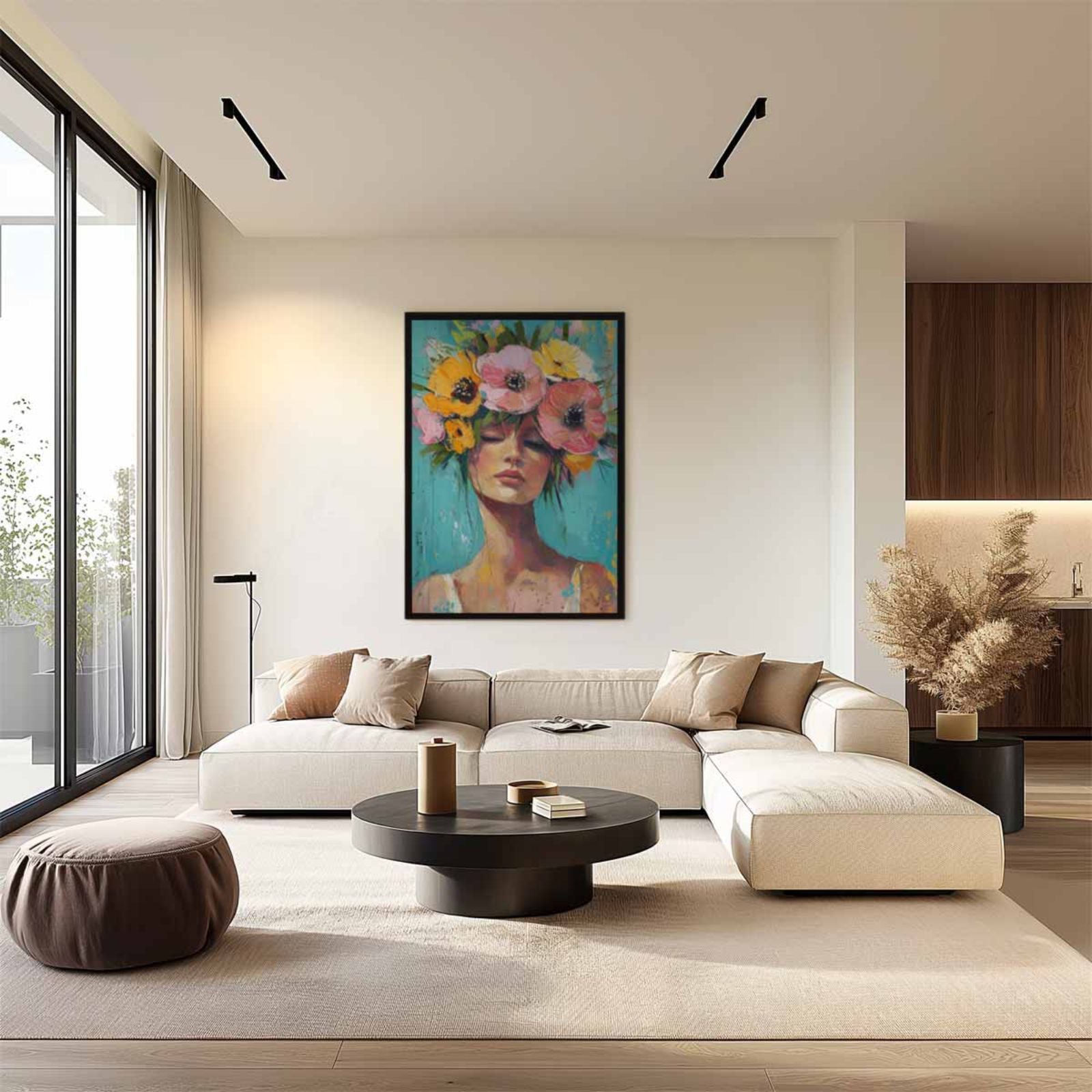
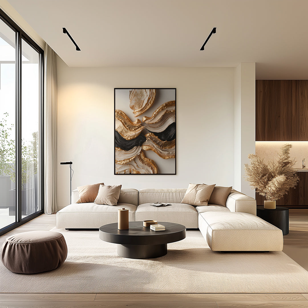
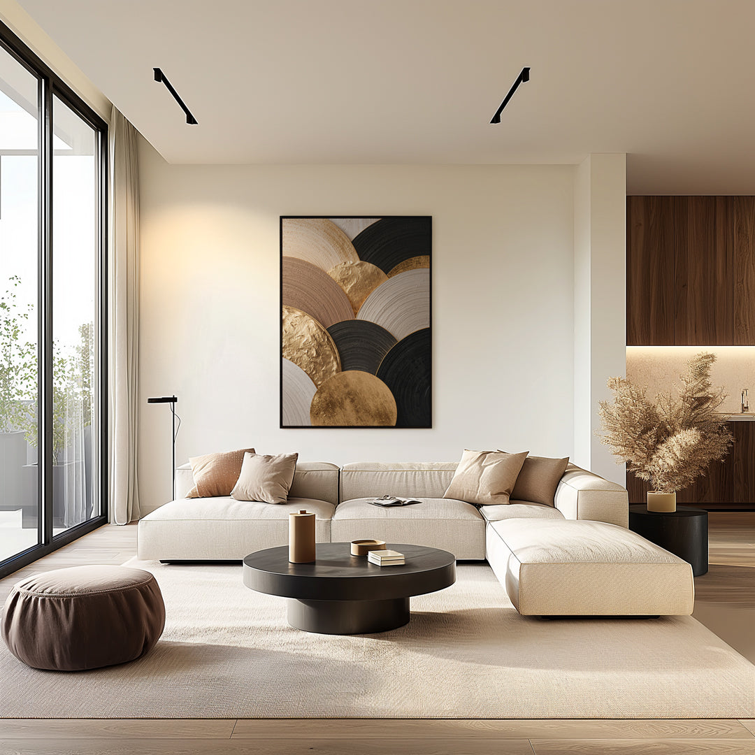
- Plenty of natural light : Rooms with large windows, a south-facing orientation, or an open feel often call for deeper, darker artwork. This creates contrast and prevents the artwork from being lost in the bright light.
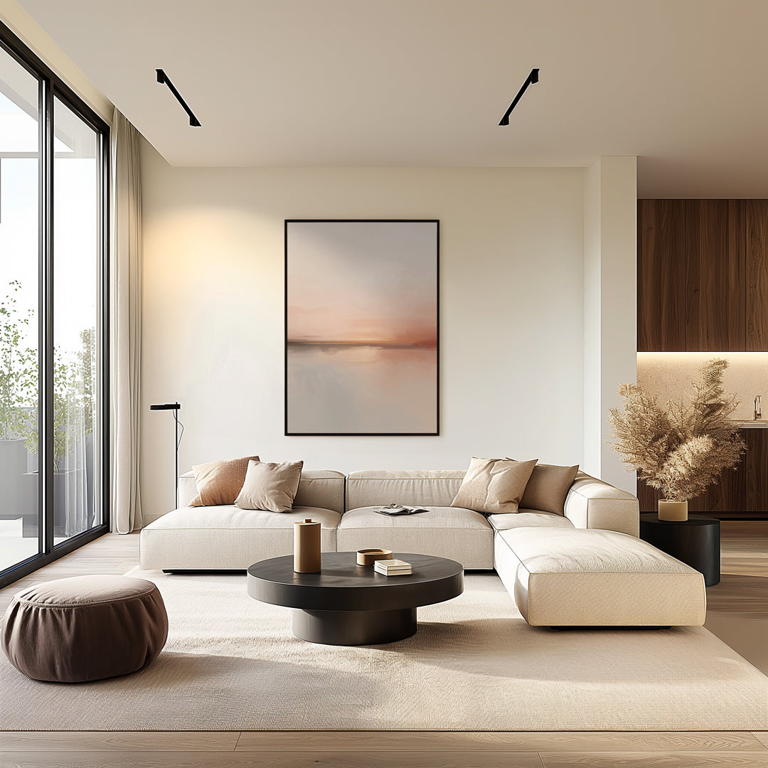
- Low daylight : In rooms with smaller windows or less direct sunlight, bright artwork works best. It reflects available light and keeps your space fresh.
Consider how the light in the room changes throughout the day. In a room with morning sun, for example, dark art with gold accents looks warm and inviting, while light art in the evening captures the last bit of light.
Match the art to the interior style
Every interior benefits from art that complements the style and color palette. Choosing light or dark art is closely related to your furniture, flooring, walls, and accessories.
- Modern & minimalist : Light art with soft lines and lots of white brings peace and fits seamlessly with sleek interiors.
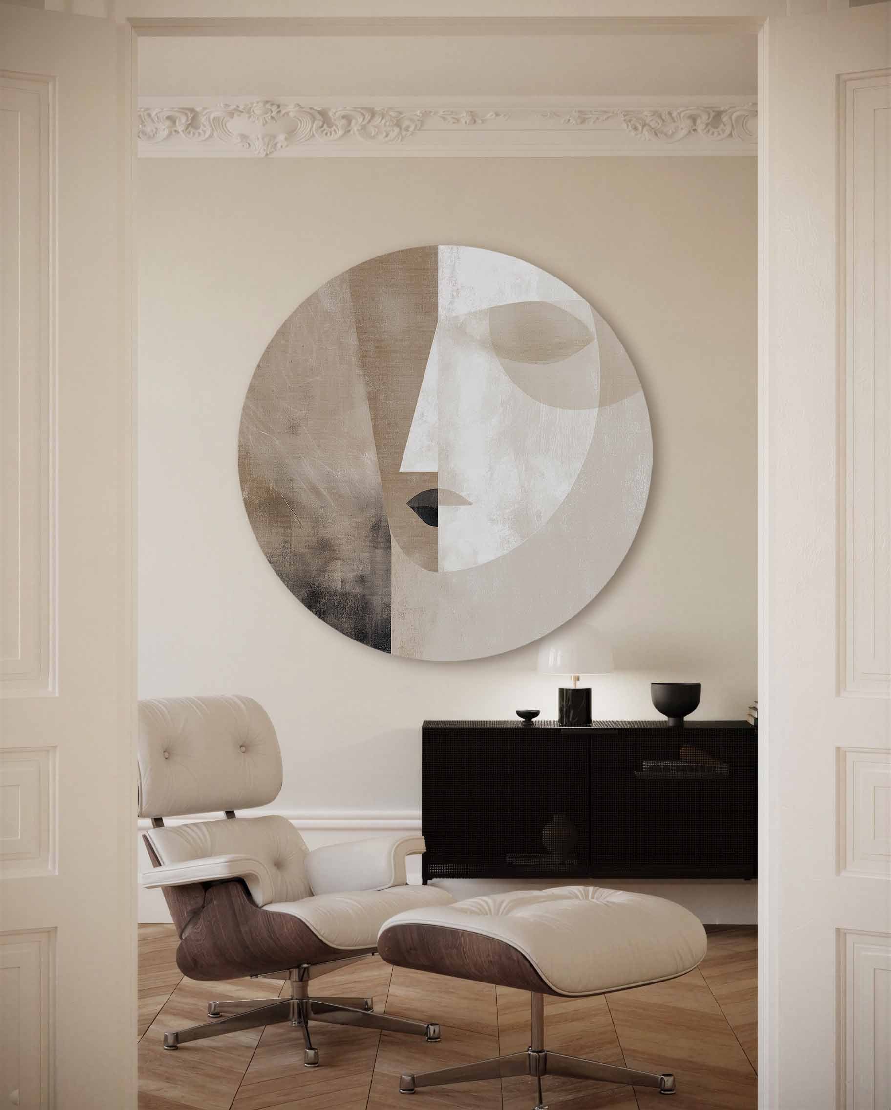
- Industrial & rugged : Dark art with a raw look, graphic shapes, or deep colors accentuate the robustness of concrete and metal.
- Classic & warm : Here you can mix and match; light and dark art work well, provided the shades complement the rest of the interior.
It can be beneficial to subtly incorporate existing colors from your furniture or textiles into the artwork. This creates cohesion without making it boring or predictable.
Combine for dynamics
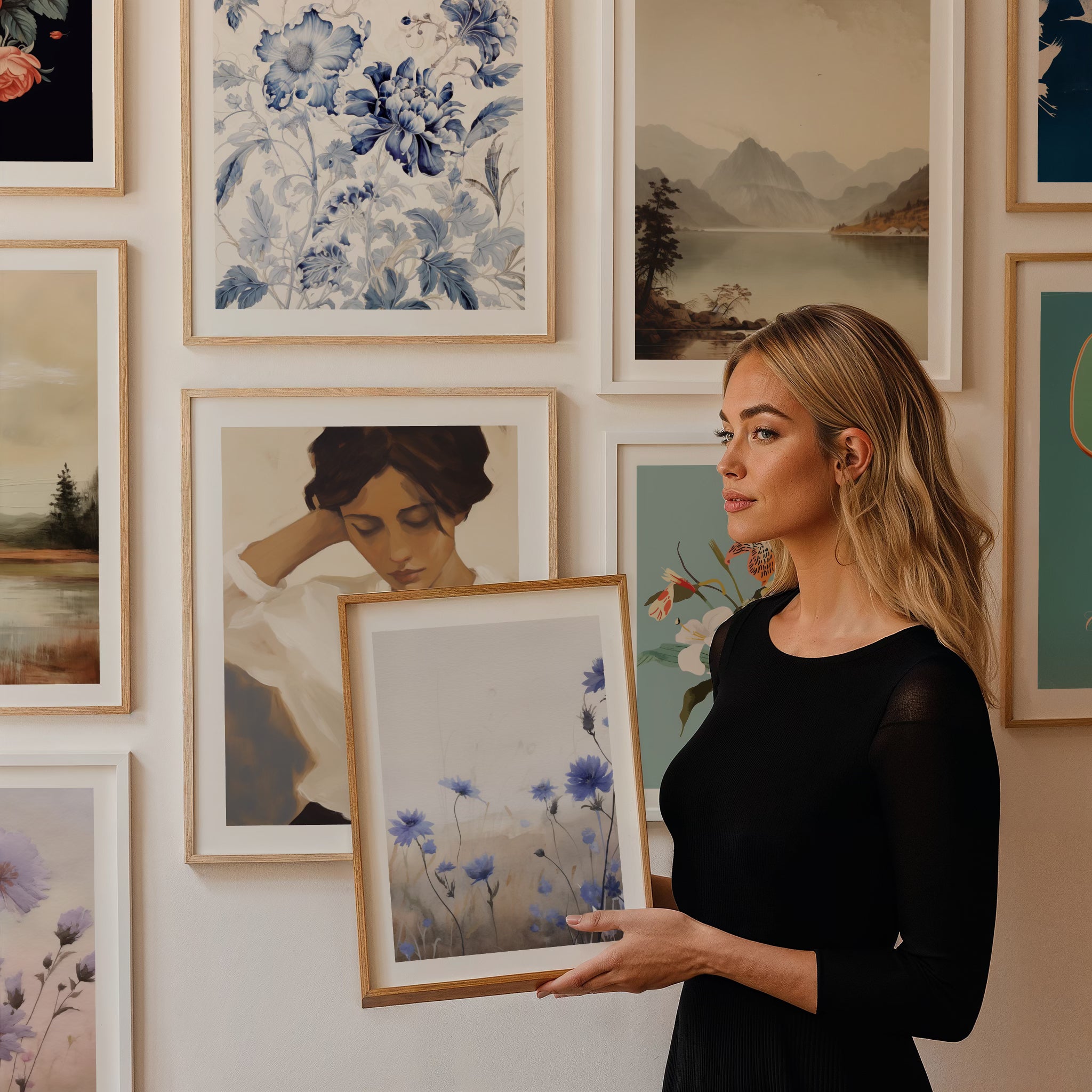
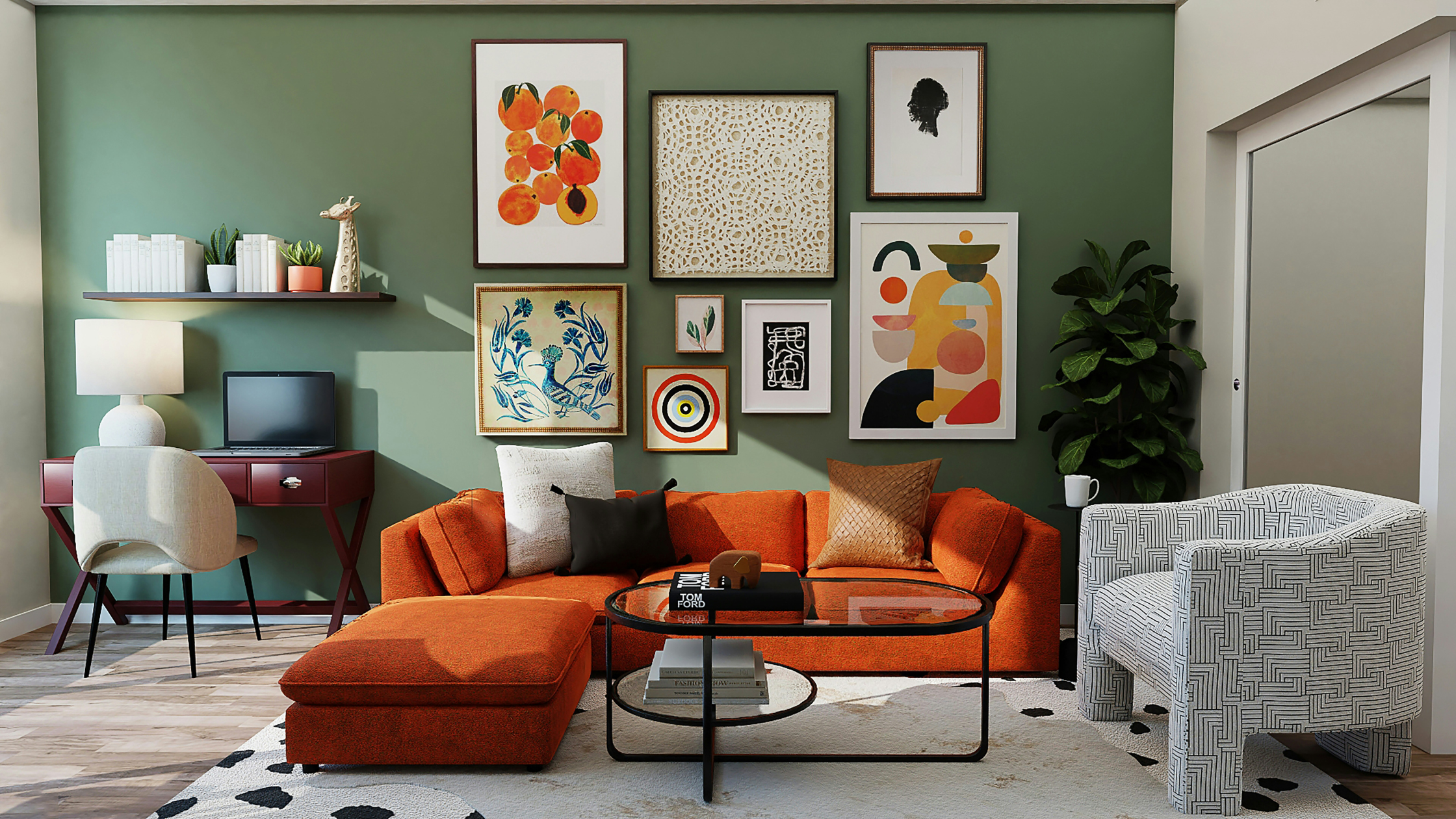
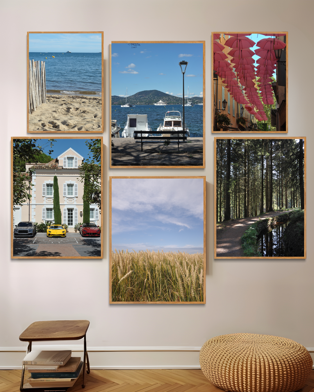
You don't always have to choose. Combining light and dark art adds depth and tension to your wall. For example, hang a light piece next to a smaller, dark canvas for balance. Alternate textures, frames, or materials to keep the overall effect playful and vibrant.
Accentuate specific living spaces
Not every room requires the same approach when choosing between light and dark art. Consider the function and atmosphere you want to achieve.
- Living room : Often the focal point, where large pieces can adorn the walls. Do you have light parquet flooring and plenty of natural light? Dare to go dark. Is it a more intimate space? Then light art creates a visual sense of space.
- Bedroom : Peace and quiet are essential here. Light art with soft colors offers relaxation, but a small, dark piece above the bedside table adds character without being overpowering.
- Kitchen and dining room : In spaces where you gather, bright art works well. It enhances the sense of space and encourages shared dining and conversation. However, abstract, dark accents can add a touch of flair.
- Hallway or corridor : These spaces are often narrow or dark. Light wall art reflects light and welcomes visitors immediately upon entering.
Materials and finishing: more than just colour
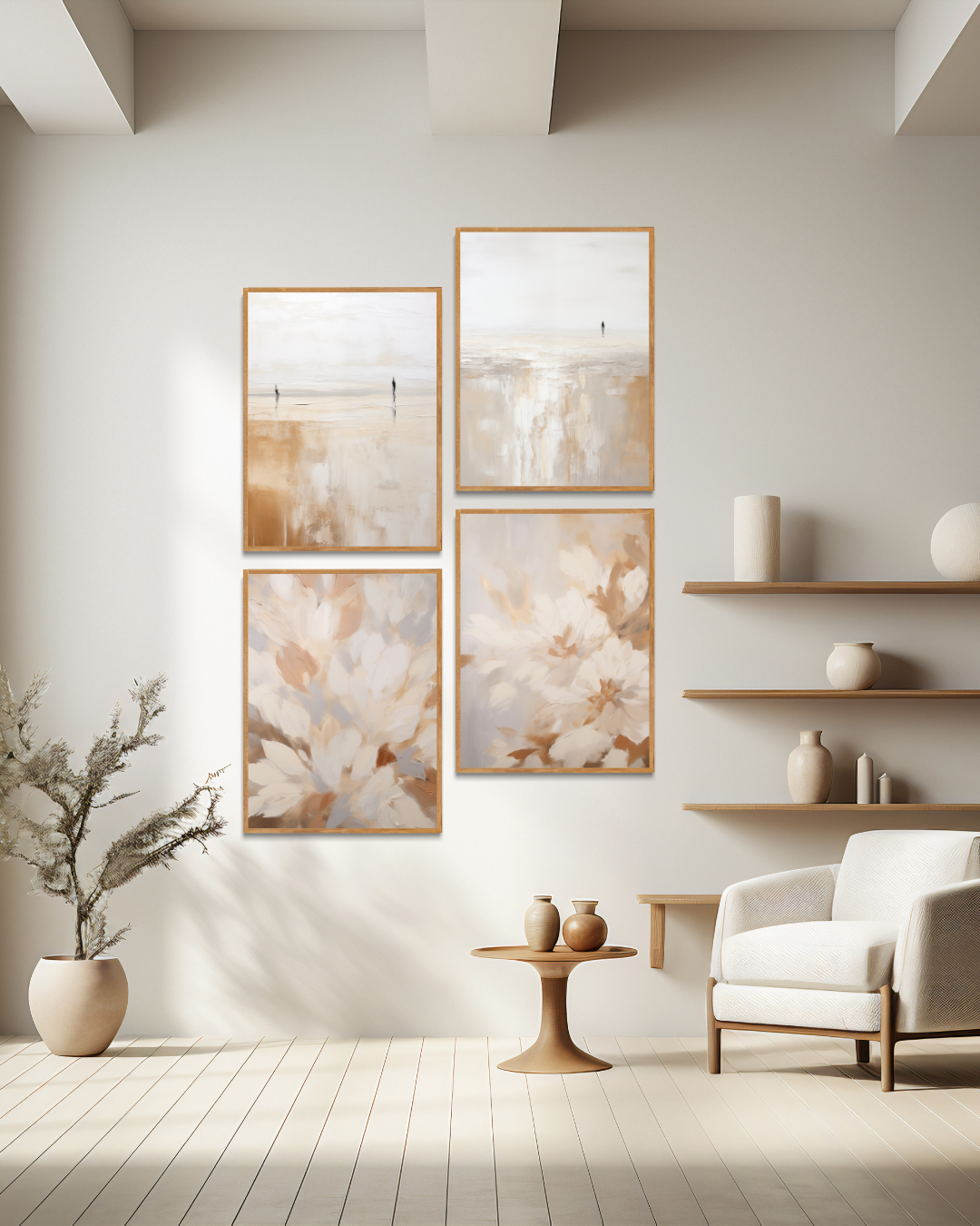
It's not just the hues, but also the texture and finish of art that contribute to the impact in your space. A light-colored painting on linen with a matte finish looks subtle and elegant. Glossy, dark artworks—such as photography behind glass or acrylic—on the other hand, immediately draw the eye and add a modern touch.
- Matte finish : For a calm, minimalist style
- Gloss and metallics : For striking, luxurious accents
- Coarse cloth or wood : Adds warmth, regardless of light or dark
With light art, you can play with transparency and layering for added depth. Dark art pairs beautifully with a robust floating frame.
Which colors do you choose for light and dark art?
The use of color in your artwork determines the atmosphere at least as much as the amount of light or dark.
- Light art : Work with pastel, white, beige, soft blue, or light green. Perfect for fresh, open interiors.
- Dark art : Deep blue, black, forest green, ochre, or burgundy. Great for warmth and excitement.
Looking for balance? Then choose art that combines light and dark elements. This way, you'll enjoy the best of both worlds.
Common mistakes when choosing light art / dark art
Even a small piece of art can make or break your interior. Avoid these common pitfalls:
- Wrong scale : A work that is too small on a large wall will disappear, or a dark piece of art that is too massive can overwhelm a narrow space.
- Neutral for convenience : Many people choose only white or black, which lacks character. Dare to experiment within the color palette!
- Forgotten lighting : Art deserves contemporary spotlights or mood lighting, especially with dark wall decoration.
- Mismatch with interior style : Not every piece suits every setting. Consider the material and atmosphere of your furniture.
Always consider what you want to emphasize in your interior and the atmosphere you want to create. Coordinate your choice of light or dark art with the overall effect.
Advice for specific situations
Not every house is the same. Here are a few practical tips:
- Apartments with little daylight : Opt for light art to maximize the feeling of space.
- Loft or large villa : Here you can go all out with dark art, because the light and surfaces allow it.
- Rooms for rent or workspace : Depending on the target group, light abstract works are inviting, while deeper colours provide focus.
- Open-plan kitchen and living room : Combine light art above the worktop with dark accents in the seating area for balance.
Let your instincts speak, but don't be afraid to ask for advice if you're unsure about choosing light or dark art. Sometimes an interior design professional can give you the push you need to make a smarter choice.
Practical steps to make your choice
Do you have a favorite artwork in mind, but aren't sure if it's a good fit? Follow these steps:
- Take a picture of the space
- Use an online tool to virtually visualize the artwork you want
- Stick a paper template (actual size) on the wall to get a feel for the size and position.
- Check the space at different times of the day; this way you experience light and color changes
- Experiment with (temporary) placements for permanent hanging
Take your time making your choice. That way, you'll be truly satisfied with the result.
Conclusion
Whether you choose light or dark art, choosing the right one for your lighting and interior is always the right choice. By paying attention to atmosphere, space, and color, you bring harmony and character to your home. Dare to experiment: let your walls speak for themselves and enjoy your personal gallery every day!

Leave a comment
This site is protected by hCaptcha and the hCaptcha Privacy Policy and Terms of Service apply.