
Which color suits which room?
Color plays a significant role in the experience of a space. Not only in furniture and wall finishes, but also in art. In this blog post, you'll learn how to coordinate colors with a space's function and how wall decor can support this.
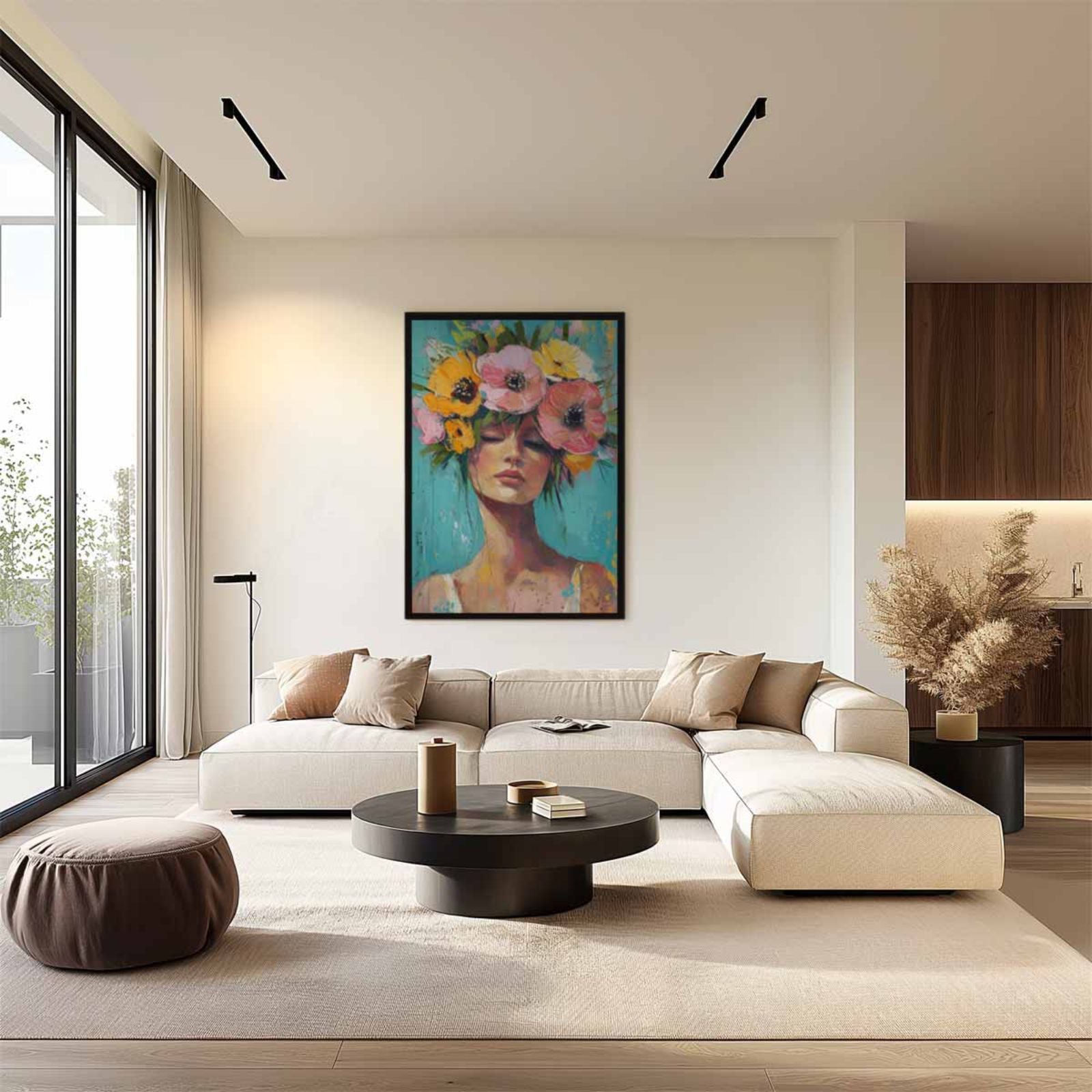
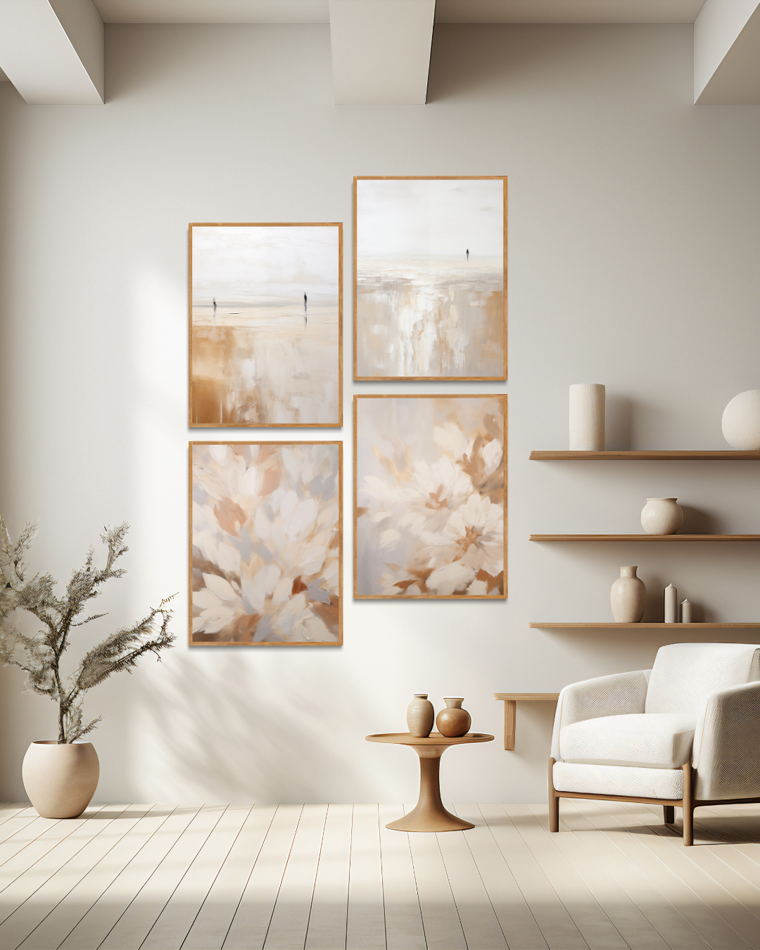
1. Living room – warm and inviting colors
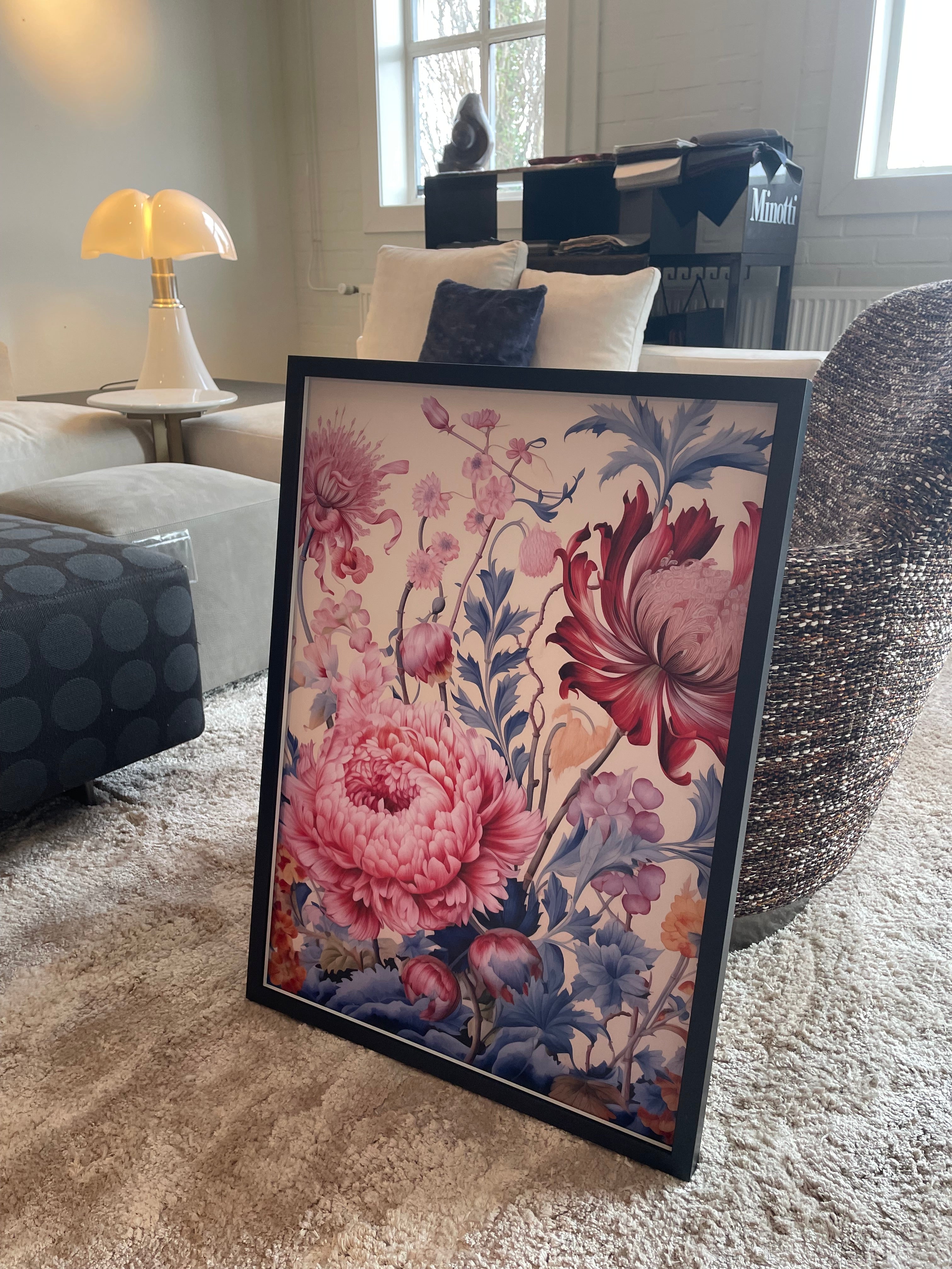
Soft earth tones like beige, sand, and warm gray work well in living spaces. Art with calming colors or subtle contrasts enhances the atmosphere without being overpowering. Small accents in colors like rust, terracotta, or deep green can add depth.
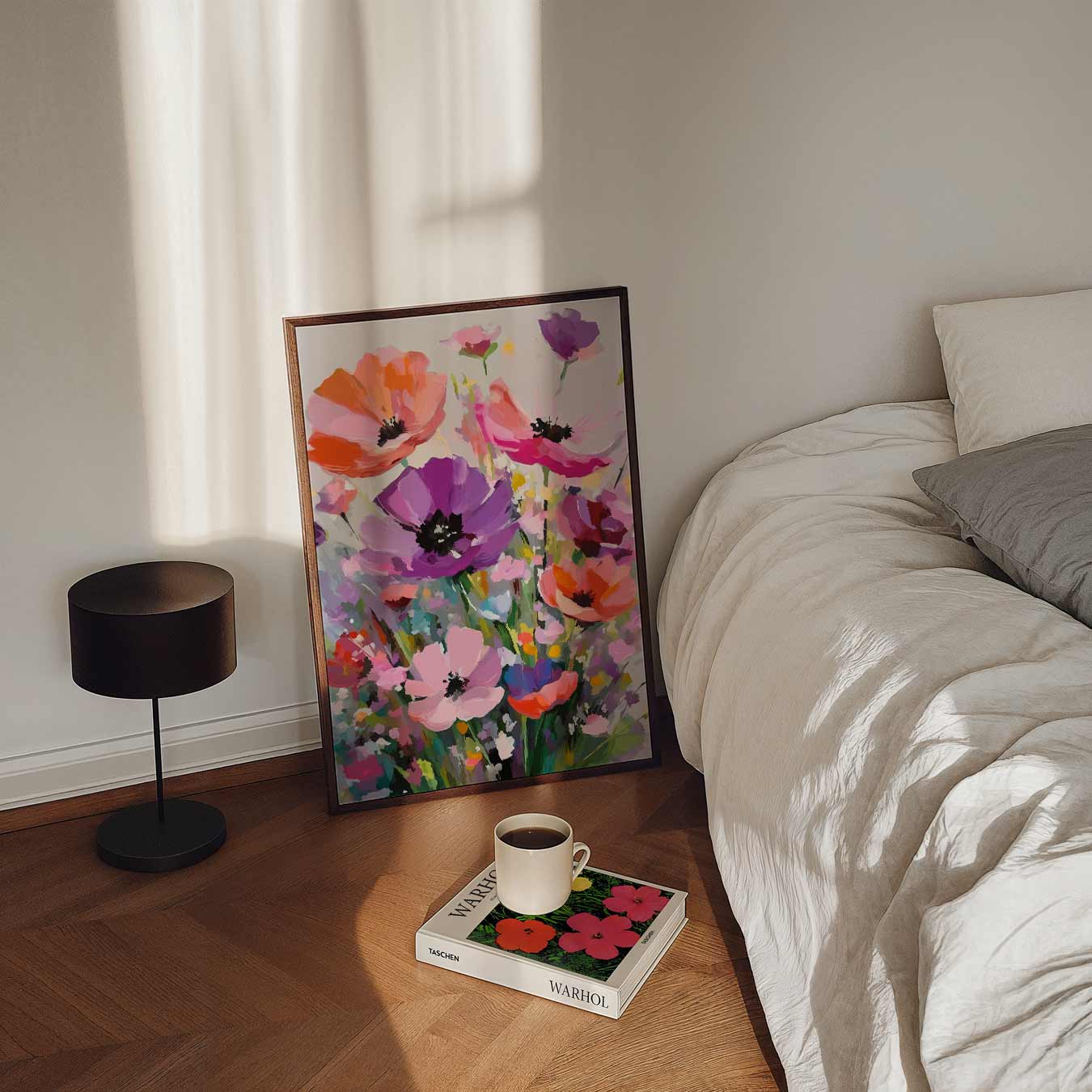
2. Bedroom – calm and balance
Preferably choose light, muted colors like light taupe, beige, pastel green, or a grayish blue. Art should be calming and preferably not contain too much contrast. Soft shapes and minimalist compositions contribute to relaxation.
3. Office or workspace – clear and focused
Neutral base colors like light gray or white work well when combined with a single contrasting color. Consider ochre, warm brown, or deep blue in the artwork. This can help stimulate concentration without being distracting.
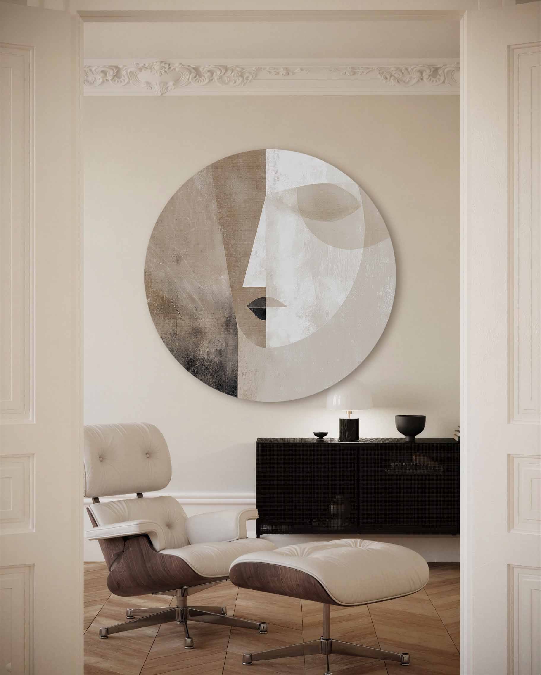
4. Hallway or entrance – first impression of the house
This is often a smaller space. Art works well here in a calm yet distinct contrast. Natural tones with a subtle accent, such as an abstract work with warm hues, can make the space feel inviting.
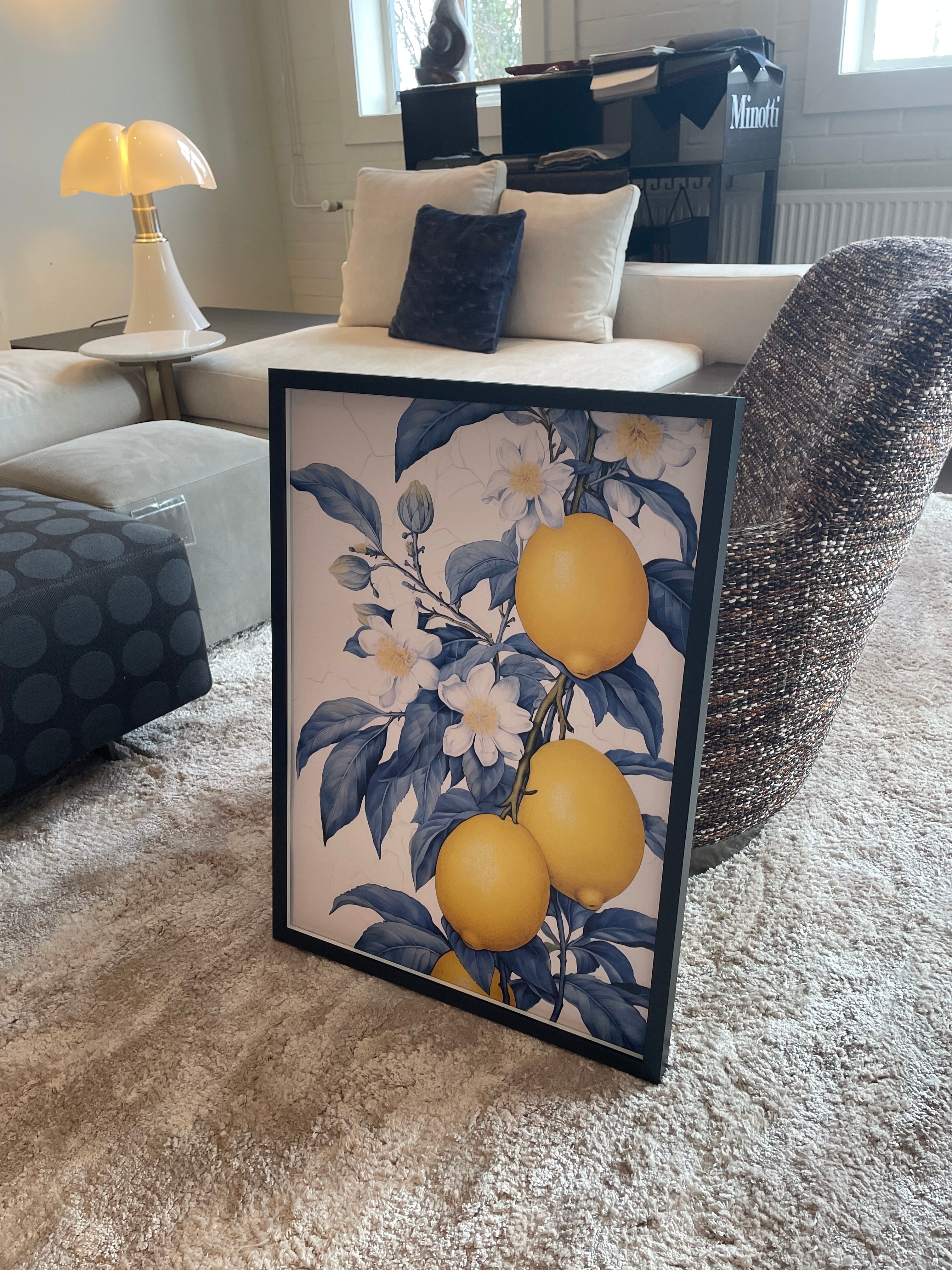
5. Kitchen or dining area – light and energy
Warm neutrals like off-white with a hint of sand or light terracotta create a pleasant base. Art can be a bit more playful, as long as it doesn't get too busy. An organic shape or light color scheme works well.
6. General tip: connecting color to materials
The artwork doesn't have to be the same color as the wall or furniture. A shade that complements natural materials like wood, linen, or ceramic creates cohesion. This creates a sense of calm rather than repetition.
When the chosen colours support what the space should radiate – tranquility, energy or welcome – the art will also fit in better with the interior.
Written by Hugo Frankruijter


Leave a comment
This site is protected by hCaptcha and the hCaptcha Privacy Policy and Terms of Service apply.