Which color suits which room? 🎨
Every color evokes a different emotion and can completely transform the atmosphere of a room. That's why it's wise to consciously choose colors that match the room's function. Here's a playful and practical guide to help you choose the perfect shade for your interior!
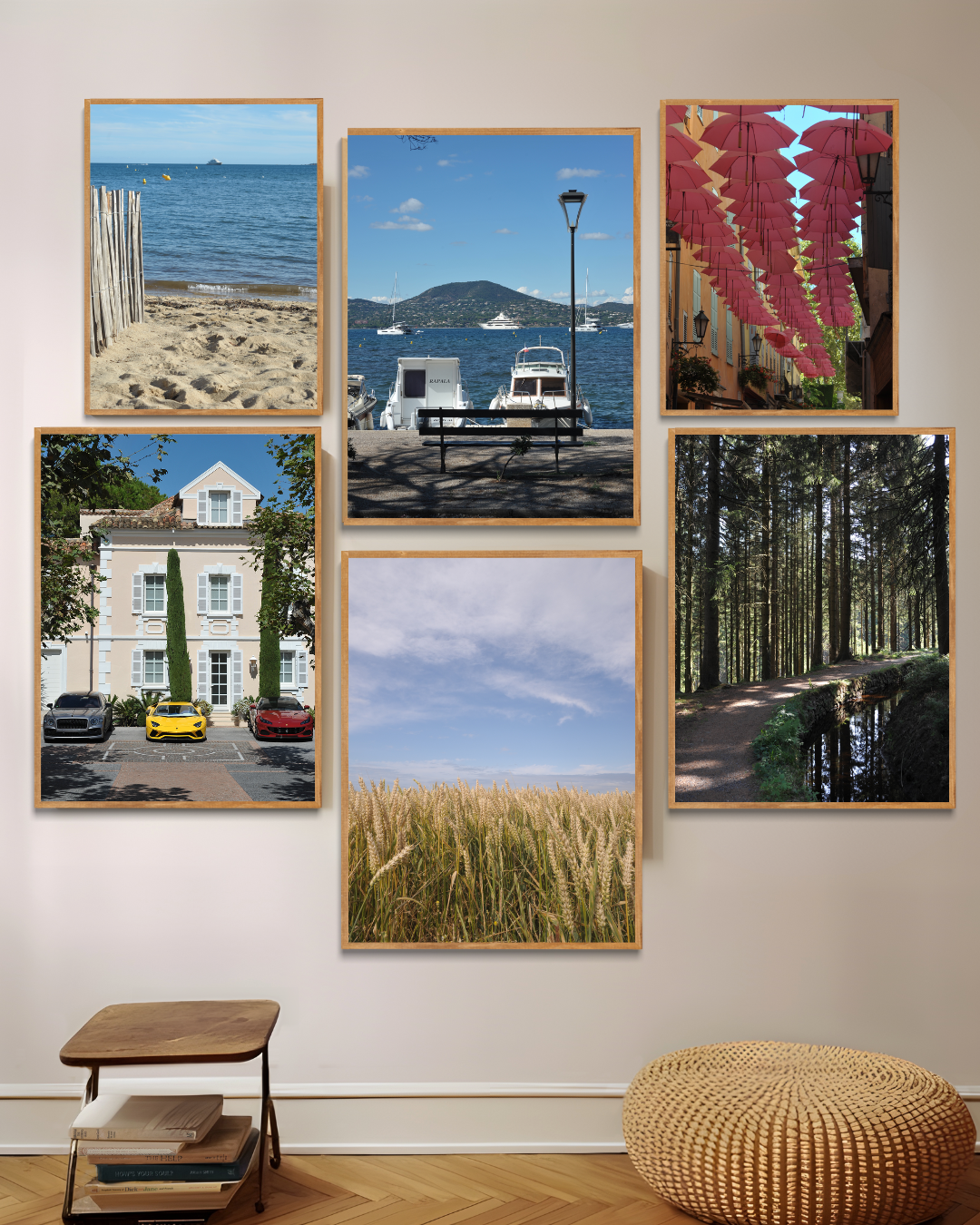
🌊 Blue – Calming & Fresh
Blue has a calming effect and is often associated with clarity, stability, and serenity. Perfect for spaces where relaxation and concentration are important!
👉 Ideal for: Bedrooms, bathrooms, studies
🖼 How to use it? Choose posters with soft blue tones, such as ocean views, dreamy cloudy skies, or minimalist designs with blue accents.
🎨 Beautiful combinations: Blue goes beautifully with white, light gray and natural wood tones for a fresh and timeless look.
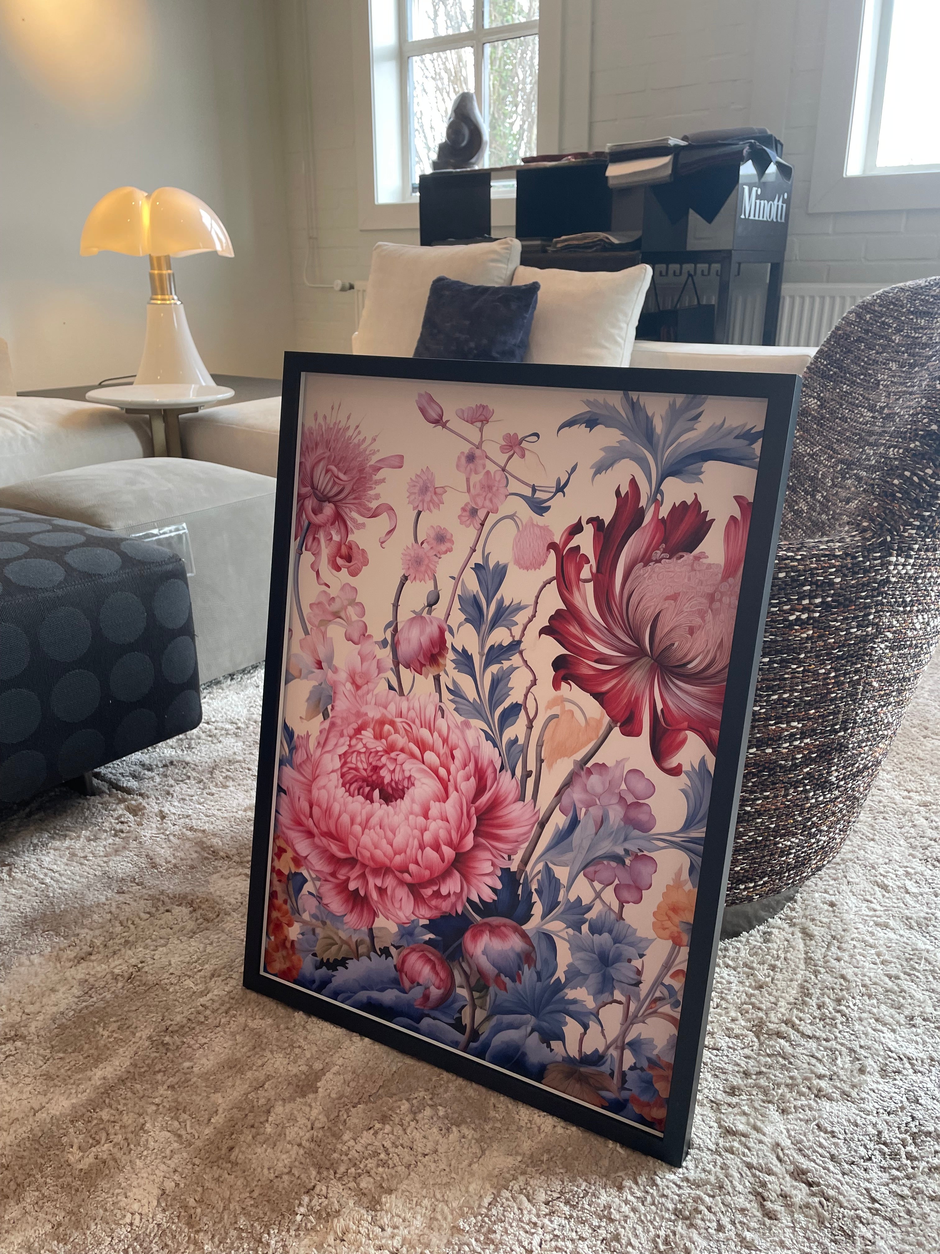
🔥 Red – Energetic & Passionate
Red is a powerful and vibrant color that instantly energizes. It stimulates activity and gives a room a dynamic feel.
👉 Ideal for: Dining rooms, living rooms, sports or hobby rooms
🖼 How to use it? Choose abstract art with red accents, vintage advertising posters, or warm red tones in botanical prints.
🎨 Beautiful combinations: Red works well with neutral shades like beige and gray, but can also create a cool contrast with black or dark blue.
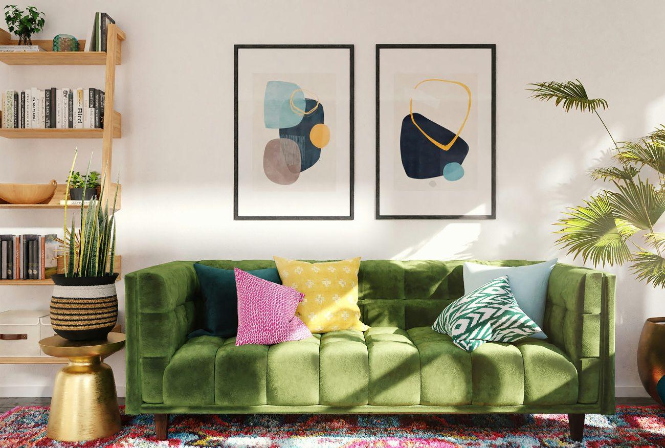
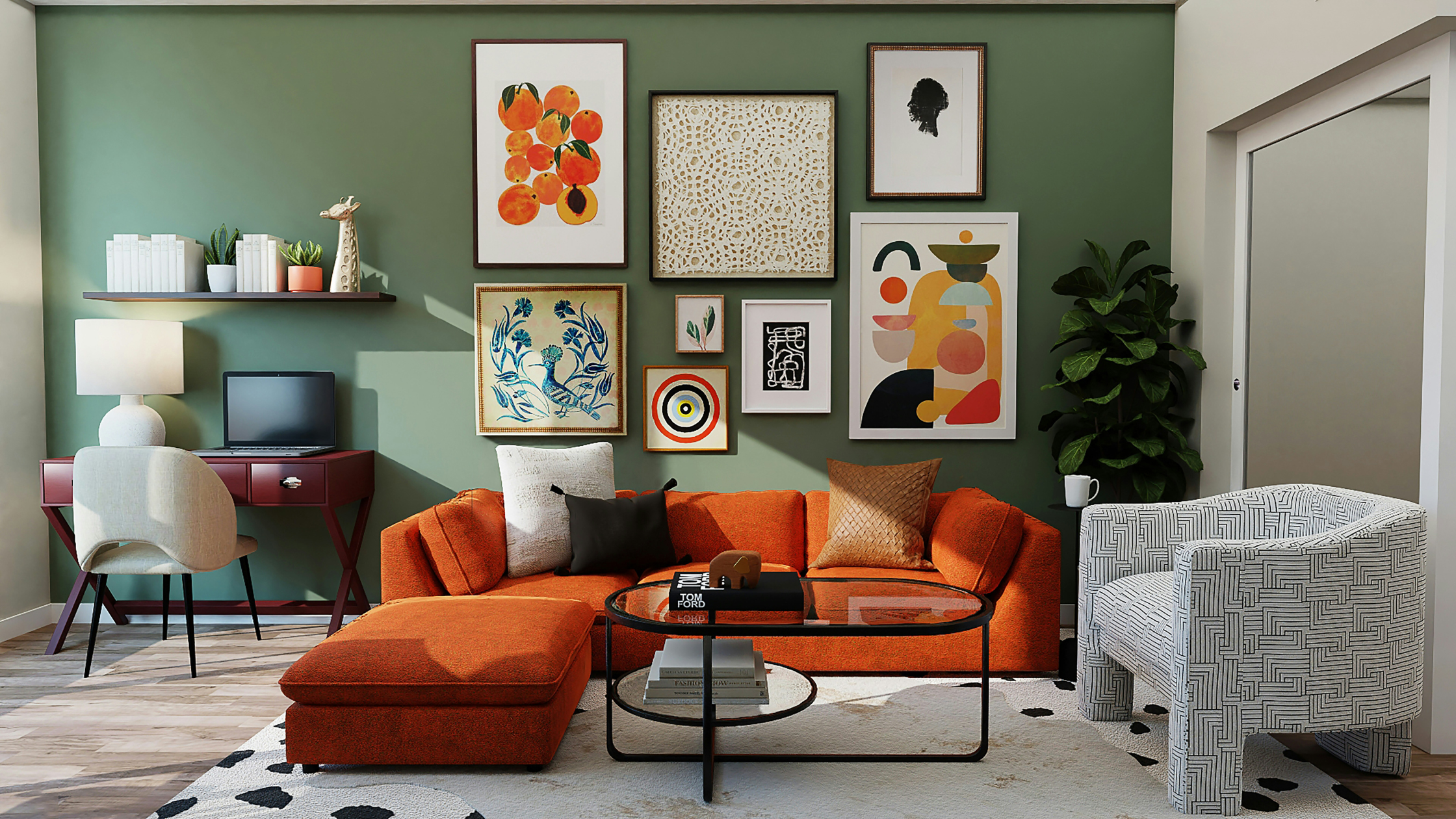
🌿 Green – Natural & Balance
Green brings peace and harmony and is often associated with nature. Perfect for creating a fresh and relaxing atmosphere in your home!
👉 Ideal for: Living rooms, kitchens, home offices
🖼 How to use it? Posters featuring tropical leaves, botanical illustrations, or serene landscapes bring a touch of nature into your home.
🎨 Beautiful combinations: Green combines beautifully with wood, beige and terracotta for a warm, natural look.
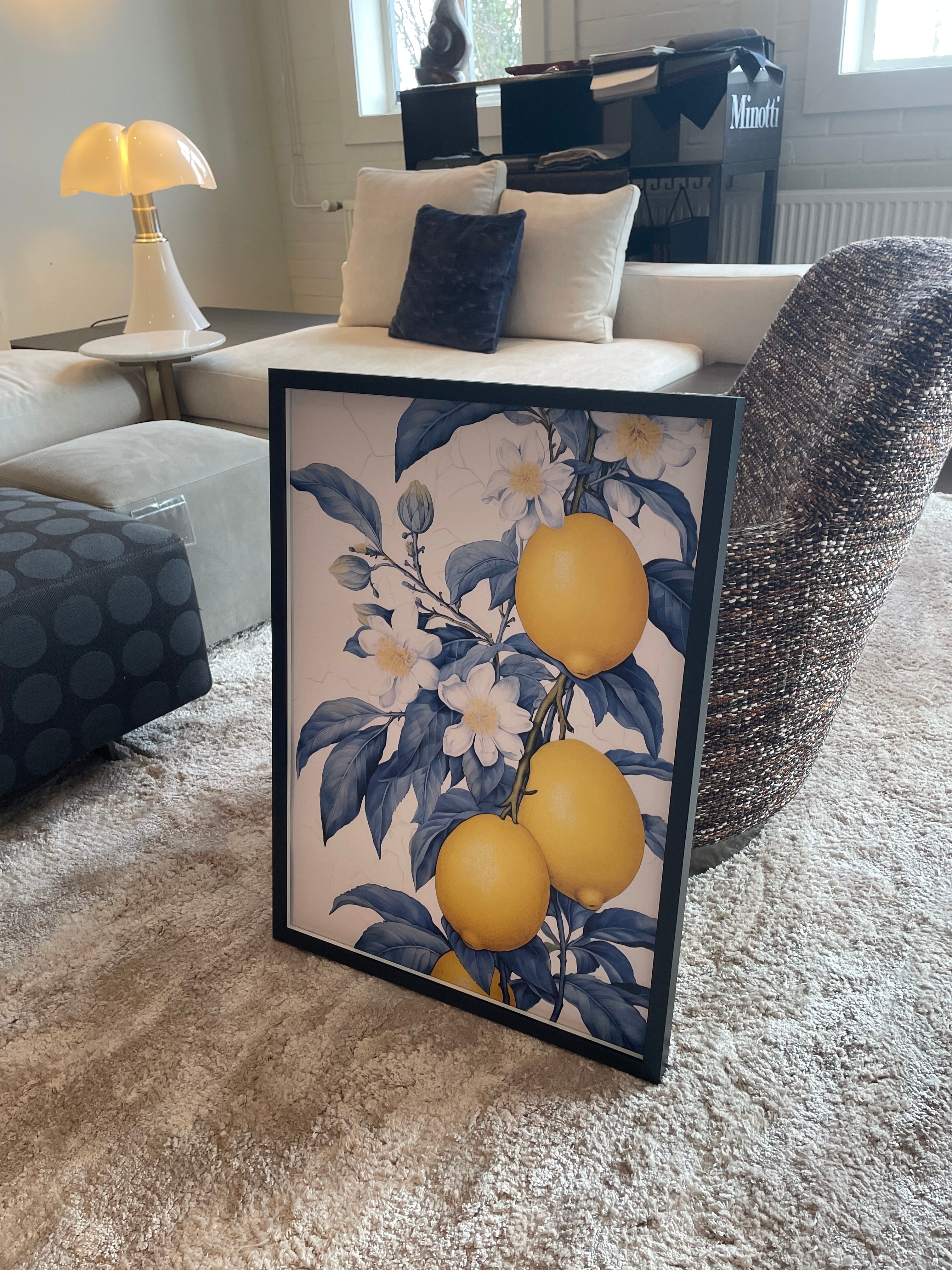
☀️ Yellow – Cheerful & Uplifting
Yellow represents positivity and energy. It adds warmth and coziness to any room and creates a sunny atmosphere.
👉 Ideal for: Kitchens, hallways, children's rooms
🖼 How to use it? Go for sunny lemon prints, retro-inspired art, or abstract designs with golden yellow accents.
🎨 Beautiful combinations: Yellow goes well with white, gray and dark blue, but can also be given a playful touch next to pastel shades.
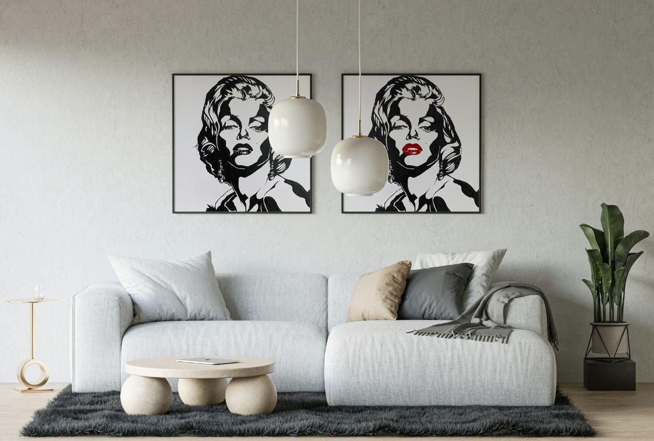
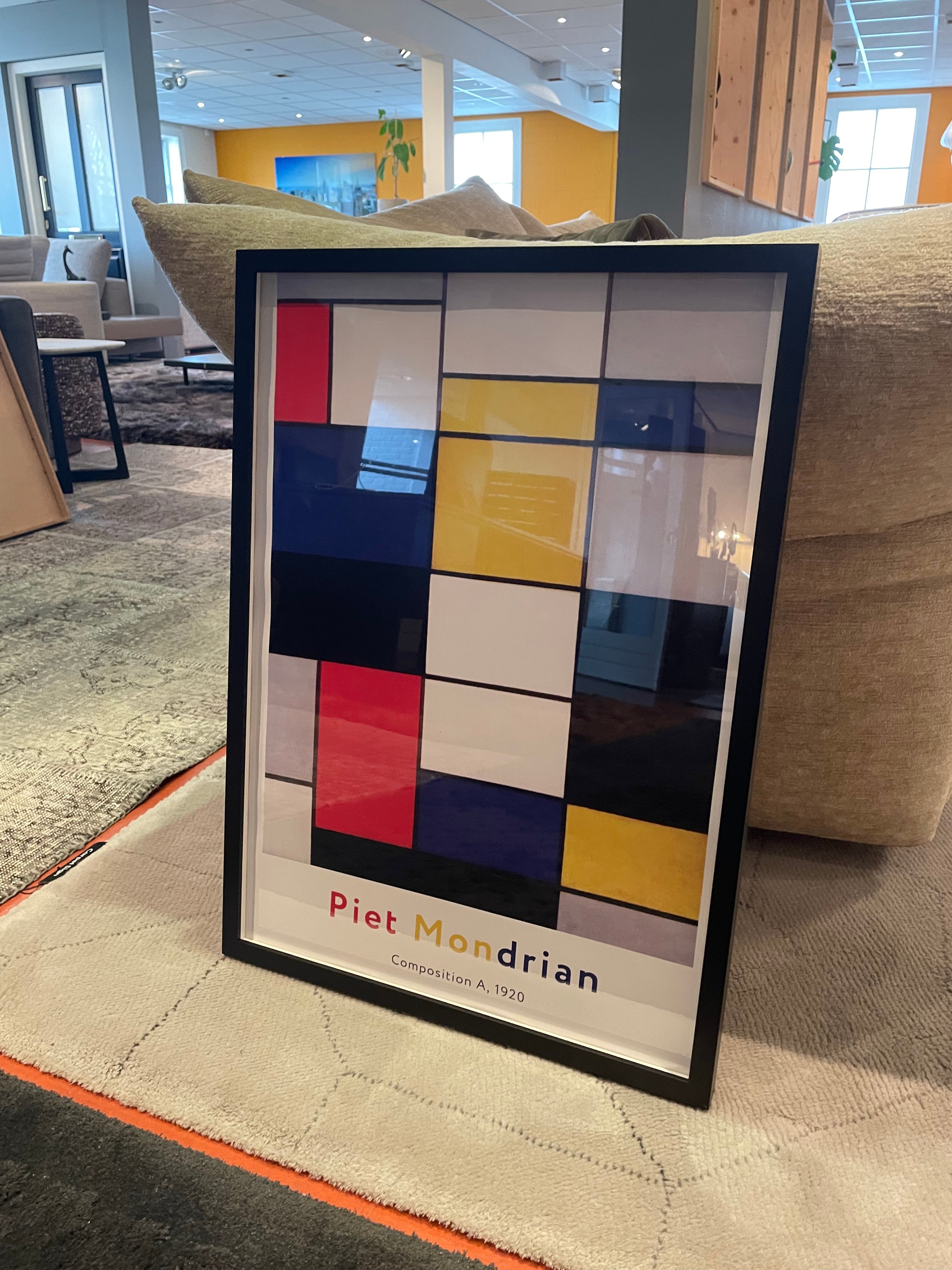
⚫ Black & White – Stylish & Timeless
Black and white is always a good choice for a sleek and modern interior. It creates contrast and gives a room an elegant, minimalist look.
👉 Ideal for: Living rooms, offices, hallways
🖼 How to use it? Think minimalist line drawings, typographic prints, or iconic black-and-white photography.
🎨 Beautiful combinations: Works well as a base for other colors, or go for a monochrome look with gray tones and metallic accents.
💡 Which color do you choose?
Whether you're going for a serene blue bedroom, an energetic red dining area, or a cheerful yellow kitchen, the right wall art will make your interior truly your own. Looking for inspiration? Discover our collection and give your walls a makeover! 🎨✨
Written by Hugo Frankruijter

Leave a comment
This site is protected by hCaptcha and the hCaptcha Privacy Policy and Terms of Service apply.